UX/UI Design, Application
Roomin: Find Your Perfect Roommate

My Role
User Researcher
Prototyping
Testing
Iterating
Tool Used
Figma
Canva
Team
3 Designers
Project Timeline
Sept 2024 - Nov 2024
Background
Finding a compatible roommate can be challenging, especially when trust and transparency are lacking. Thus, during my Master's program at the University of Toronto, my team and I explored ways to simplify this experience, creating a solution that connects individuals based on shared interests and lifestyle compatibility.
The Problem
How might we help young people find compatible roommates to improve their living experience and create a comfortable environment?
Our Solution
Roomin, a roommate-matching app that connects people based on shared interests and living preferences, making it easier to find compatible roommates and create a comfortable living environment.
Finding The Gaps
To kick off our research, we conducted a competitor analysis and looked at existing apps and websites. We understood that several platforms address similar issues. Hence, our goal was to create a solution that stands out by addressing these gaps.
Apps and Websites Reviewed:

Key Insights:
Lack of Personalization:
Inefficient tools to match users based on shared values, interests, or lifestyle preferences.
Transparency Issues:
Frequent scams and unverified listings create trust barriers.
Exclusivity in Listings:
Some specify preferences based on ethnicity, religion, or gender, limiting inclusivity.
Listening To Users
Despite gaining a solid understanding of the gaps in existing platforms, we knew it was essential to hear directly from users. After all, they are the ones navigating these systems daily. To design an impactful solution, we also want to focus on understanding user frustrations, pain points, and thoughts on the current roommate search experience.
Here were the key takeaways from interviewing 8 users:
~ 87%
Worried about trusting a roommate.
~ 63%
Wanted an easier way to find roommates
~ 75%
Wanted verification systems
~ 75%
Wanted advanced lifestyle filters.

Insights To Personas
From these interviews, we gained valuable insights into user needs, preferences, and challenges, which became the foundation for shaping our design decisions. To bring our research to life, I translated these findings into a user persona that captures our target audience's core characteristics and goals.
Building Dani’s Journey
After developing our persona, we continued to build out Dani's story to understand our idea's feasibility and impact. Using the persona as our guide, I developed a user's journey map to outline Dani's experience with the app. This helped us visualize their steps, address pain points, and ensure a smooth, intuitive process tailored to user needs.

The Design Solution
By mapping Dan's journey, we were able to deeply understand the pain points and opportunities that users experience when searching for a compatible roommate.
Combined with insights from our research and user interviews, this process helped us identify the essential features that would address these challenges and make the app both effective and user-friendly.

Add reviews to increase trust

Compatibility score for easier match

Verification system to prevent scams

Advanced filter for precise matching

Sketching The Vision
With a clear understanding of user needs and the core features defined, we moved on to creating low-fidelity wireframes. These sketches helped us visualize the app's structure and ensure a seamless user experience.
I focused on designing the home page and preferences pages while refining each screen to make it cohesive and aligned with the user flow.
Testing Our Ideas Early
Once the low-fidelity wireframes were ready, we moved on to usability testing. We wanted to test early because it allowed us to see how real users interacted with the app and spot any issues while changes were still easy. This feedback helped us refine the design and ensure the user flow felt smooth and intuitive.
“Too much information on the initial screen”
“Infinite scroll can decrease engagement”
“Filter preferences was hard, it took a lot of time.”
"Focus on important information to show"
Iteration Based On Feedbacks
Here are the main changes we implemented based on the feedback from 10 participants consisted of 8 users, and 2 UX/UI design experts:
Defining The Essence
Once we had the iterated prototype, we wanted to create the look and feel of the app for our pitch after the project is done. Thus, we decided to include a moodboard.
Here were words that the team and I came up with for the moodboard:
1. Trustworthy
2. Engaging
3. Clean
4. Welcoming

Crafting The Identity
After defining the tone and feel with the moodboard, I created the style tile to help translate those ideas into specific design elements like colors and typography. It ensured the app's look remained consistent and aligned with our vision.

1. Gamified The Design To Boost Engagement
Problem: 7/10 participants expressed a desire for increased engagement in the app. User interaction was low, and participants were looking for features to make finding a roommate more fun and engaging.
Solution: We adopted a similar feature in a dating app where users can swipe left and right or press X or check button to select potential roommates
Before

After

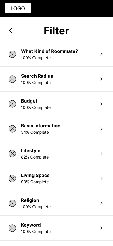
2. Overwhelming and Confusing Filters
Problem: 9/10 participants were overwhelmed and had difficulty finding specific categories and preferences in the filter.
Solution: Initially, we had a horizontal scroll for filter categories, but some were hidden. Hence, we changed it to a vertical scroll to show all categories.
Before

After
3. Information Overload In Profile Screen
Problem: 8/10 participants suggested finding a way to minimize the information being displayed on the roommate profile screen. They wanted more control over which information they wanted to see.
Solution: Instead of showing all information at once, we set default displays for each category with expand and minimize buttons. This reduces clutter and gives users more control over what they want to see.
Before

After

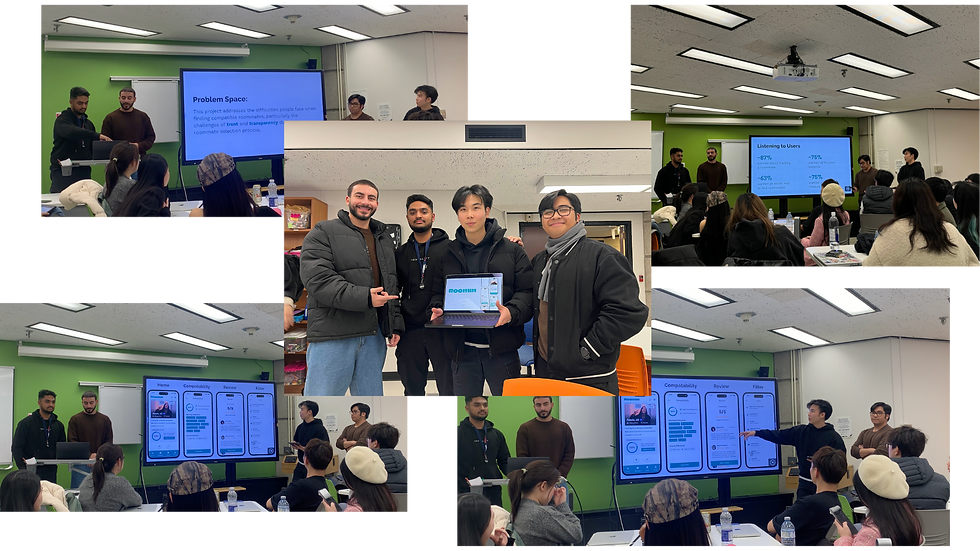
Final Design


A Snippet of Our Final Pitch
Next Steps
Moving forward, our focus remains on refining the experience and ensuring the platform evolves to meet its users' needs. Here are 3 key areas we want to emphasize.
1. Enhancing Advanced Filters
Advanced filtering options will be refined to improve usability and help users find matches efficiently. This will include criteria to make searches more personalized while maintaining simplicity and intuitiveness.
2. Exploring Gamified Experiences
Different gamification elements will be explored to boost engagement without the platform resembling a dating app. These additions aim to encourage interaction while retaining the platform's professional tone.
3. Continued Usability Testing
Broader usability testing will validate new features, gather diverse feedback, and uncover areas for further improvement. This iterative approach ensures that the platform meets user expectations and practical needs.
What I learned
1. Designing for the Invisible Stakeholder: Trust
During this project, I realized that trust isn’t just a byproduct, but it’s a stakeholder. Every design decision, from organizing content to crafting clear and approachable wording, had to build trust. The challenge was finding the balance between being transparent and oversharing, ensuring the platform remained both professional and welcoming. This perspective reshaped how I approached user flows and the app’s overall tone.
2. Balancing Ambition with Authenticity
As we explored gamification elements to enhance engagement, I realized how important it is to stay true to the platform's purpose. The temptation to overdesign or incorporate overly playful features was real, but staying grounded in the app's goal kept the design authentic. This balance between innovation and restraint taught me how to maintain focus on user trust while still creating an engaging experience.

